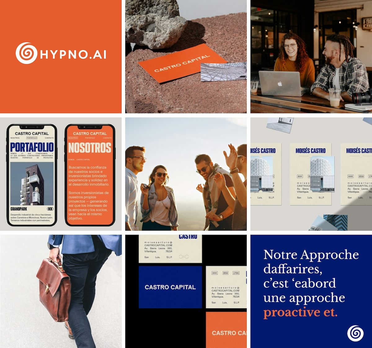
Finsharpe is an AI-led investment advisory company working at the intersection of quantitative stock analysis and cutting-edge technology. Their backend systems and algorithms were deeply robust, but their brand communication lacked the structure, polish, and visual uniformity needed to stand out in a competitive fintech market. They approached me to help rebuild their brand communication without changing their existing logo, while also establishing a professional tone across all outward-facing platforms—particularly on LinkedIn.
Challenge
The brand had evolved significantly in its technical capabilities, but its visual identity hadn’t kept pace. The existing communication assets—from pitch decks to investor reports and social media content—lacked cohesion and failed to reflect the company’s modern, AI-driven foundation. What was needed wasn’t a new logo, but a complete revamp of how the brand presented itself visually and digitally, particularly across investor communications and professional networking channels.
Our solution
We began by redefining Finsharpe’s visual tone, building out a consistent design system that would inform all communication assets. This included refining the layout structures, typography, and color logic to reflect clarity, confidence, and digital precision. While the logo remained untouched, every supporting asset was redesigned—from pitch presentations to branded documents—ensuring they were now aligned with the company's forward-thinking narrative.
On LinkedIn, we introduced a new content direction and visual storytelling system. Instead of traditional financial content, the posts communicated complex ideas with sharp, data-informed visuals that resonated with both tech-savvy investors and financial professionals. This approach not only brought visual consistency, but helped establish Finsharpe as a brand that was both credible and quietly innovative.
300
x
Increase in Engagement
500
%
Faster Page Load Times
400
%
Growth in Conversion
Visual Style Guide Creation
To ensure long-term consistency, we delivered a fully-documented brand manual outlining every element of their identity system. This included color hierarchy, typography selection, layout systems, and social post formats. We also created reusable visual blocks and templates for LinkedIn, pitch decks, and project updates—ensuring the in-house team could manage future communication without dilution.
#48B493
#B7DCCD
#F9C784
#F4F4F4
#1A1A40
#000066
Typography
Poppins
Heading Font
Aa Bb Cc Dd Ee Ff Gg Hh Ii Jj Kk Ll Mm Nn Oo Pp Qq Rr Ss Tt Uu Vv Ww Xx Yy Zz
0123456789!@#$%^&*()_+
Sparklabs transformed our digital presence with their innovative strategies and expert team. Our engagement and sales have skyrocketed. We couldn't be happier with the results. Highly recommend their services!