Finsharpe is a fintech company that integrates quantitative financial analysis and artificial intelligence to help individuals build smarter investment strategies. While the backend was functionally advanced, the user-facing web application lacked clarity and emotional engagement. The platform’s power was undeniable, but its interface did little to communicate confidence, ease, or approachability—especially to users unfamiliar with technical finance models.
Challenge
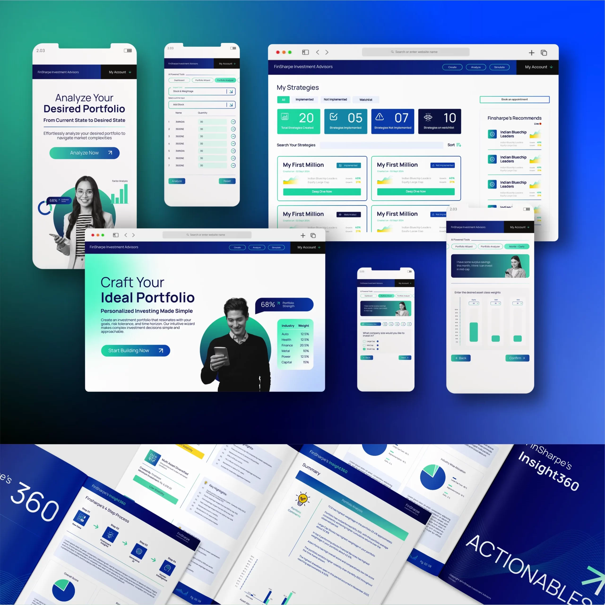
The core challenge was to take a technically sound but visually underwhelming platform and transform it into something intuitive, navigable, and trustworthy. The application was structured around three primary modules—Create, Analyse, and Simulate—but the user journey between these was disjointed, and the interface lacked visual clarity and feedback. Finsharpe’s value proposition lay in its ability to distill complex financial logic into personalized insights—yet this clarity was missing in its interface.
My role was to redesign the platform’s UI so that it would feel more natural to use, logically structured, and visually aligned with the product’s intelligence.
Our solution
The redesign began with a deep understanding of the three functional modules. In Create, users were presented with various financial scenarios and asked to make choices regarding investment patterns—such as mid cap, small cap, or large cap—based on their preferences. The system would then recommend an investment portfolio using Finsharpe’s AI-powered quantitative models. The challenge here was to make this process engaging and frictionless, so users felt empowered rather than overwhelmed.
In the Analyse section, users could view and evaluate their current portfolios. I redesigned this interface to surface insights more clearly, giving weight to important metrics while reducing clutter around secondary information. The goal was to present complexity without making the screen feel crowded.
The third module, Simulate, allowed users to explore future scenarios and project how their portfolios might perform over time. Here, the emphasis was on making forward-looking data feel reliable and digestible. I used visual hierarchy and layout logic to guide attention toward projections, comparisons, and decisions—helping users gain insight without requiring deep technical knowledge.
Throughout the redesign, the focus was on translating a sophisticated backend into a confident and accessible front-end experience. I retained the integrity of the technical workflows while visually organizing the interface in a way that felt clean, clear, and thoughtfully spaced. The updated UI gave Finsharpe a design system that better reflects its core mission—making intelligent investing easier for everyday users.
300
x
Increase in Engagement
500
%
Faster Page Load Times
400
%
Growth in Conversion
Visual Style Guide Creation
To ensure long-term consistency, we delivered a fully-documented brand manual outlining every element of their identity system. This included color hierarchy, typography selection, layout systems, and social post formats. We also created reusable visual blocks and templates for LinkedIn, pitch decks, and project updates—ensuring the in-house team could manage future communication without dilution.
#48B493
#B7DCCD
#F9C784
#F4F4F4
#1A1A40
#000066
Typography
Poppins
Heading Font
Aa Bb Cc Dd Ee Ff Gg Hh Ii Jj Kk Ll Mm Nn Oo Pp Qq Rr Ss Tt Uu Vv Ww Xx Yy Zz
0123456789!@#$%^&*()_+
Sparklabs transformed our digital presence with their innovative strategies and expert team. Our engagement and sales have skyrocketed. We couldn't be happier with the results. Highly recommend their services!