Based in Pune, Creativve Constructiions operates in a sector where branding is often seen as secondary. Most players rely on word of mouth or direct industry relationships, resulting in inconsistent or absent branding altogether. But this client was different—they saw the long-term value in building a brand that was not just about presence, but about perception. Their leadership team believed that if their on-ground execution was precise and timely, their brand needed to reflect the same level of care, clarity, and consistency.
Challenge
Creativve Constructiions approached me with a clear intent—to move beyond the typical raw, unpolished presence that most construction firms carry, and instead, build a brand that felt structured, strategic, and visually aligned. As a company operating in the industrial construction sector, they offer turnkey solutions, PEB structures, EPC contracts, and complete infrastructure execution. However, their growing business required a presence that reflected more than their services. They needed a brand that communicated professionalism, trust, and modernity across every touchpoint.
The biggest challenge lay in the disconnect between the work Creativve Constructiions was delivering and how they were visually perceived in the market. They had no cohesive identity—no defined fonts, colors, or tone. Their presence across platforms, especially LinkedIn, lacked direction. In an industry often dominated by hard visuals and rugged tone, the goal wasn’t to make them flashy—it was to make them recognizable, trustworthy, and professionally aligned without losing their industrial core. We had to bridge the gap between what they do and how they present themselves.
Our solution
The solution began with building the brand from the inside out. We started by deeply understanding the company’s values, their tone on-site, their client relationships, and how they made decisions. This allowed us to translate those intangible qualities into visual elements—resulting in a brand identity system that was both minimal and grounded.
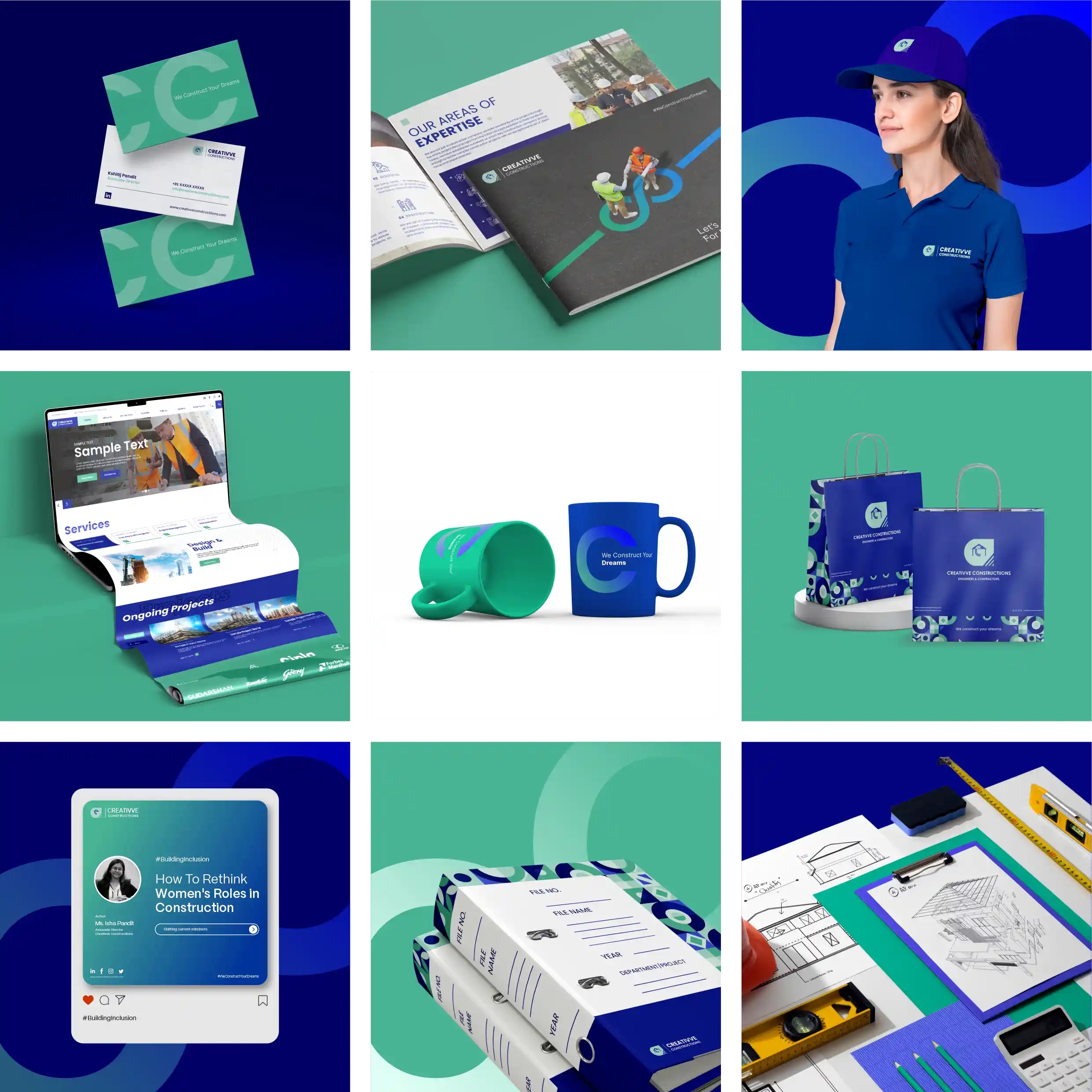
From creating a complete visual brand guide—including fonts, color palette, and grid systems—to structuring how their content would show up on LinkedIn, we ensured that every piece of communication was consistent and clear. We also developed a tone of voice that sounded experienced, intellectually rooted, and thoughtfully composed—perfect for the kind of industrial clients they work with.
Beyond design, we provided monthly LinkedIn content calendars and worked closely on building a narrative that connected industry insights with on-site progress updates—helping position them as a serious player with both execution credibility and visual maturity.
Beyond design, we provided monthly LinkedIn content calendars and worked closely on building a narrative that connected industry insights with on-site progress updates—helping position them as a serious player with both execution credibility and visual maturity.
300
x
Increase in Engagement
500
%
Faster Page Load Times
400
%
Growth in Conversion
Visual Style Guide Creation
To ensure long-term consistency, we delivered a fully-documented brand manual outlining every element of their identity system. This included color hierarchy, typography selection, layout systems, and social post formats. We also created reusable visual blocks and templates for LinkedIn, pitch decks, and project updates—ensuring the in-house team could manage future communication without dilution.
#48B493
#B7DCCD
#F9C784
#F4F4F4
#1A1A40
#000066
Typography
Poppins
Heading Font
Aa Bb Cc Dd Ee Ff Gg Hh Ii Jj Kk Ll Mm Nn Oo Pp Qq Rr Ss Tt Uu Vv Ww Xx Yy Zz
0123456789!@#$%^&*()_+
Sparklabs transformed our digital presence with their innovative strategies and expert team. Our engagement and sales have skyrocketed. We couldn't be happier with the results. Highly recommend their services!