Genfit Sports Pvt. Ltd. is building an ecosystem where sports coaching, consulting, and management are brought together under one structured framework. Their services include working with schools, societies, and sports institutions—delivering long-term sports solutions with operational excellence and measurable impact.
Challenge
Like many in the Indian sports space, Genfit was starting out in a sector that’s often driven by passion but lacks brand maturity. Most sports service providers focus on performance over presentation, energy over clarity. Genfit’s challenge was different: they wanted to look reliable, expert, and future-focused—without losing the sense of motion and dynamism that defines sports.
They needed a complete brand refresh—starting from visual identity and stretching across proposals, reports, presentations, and operational documents. Everything had to reflect not just who they are, but who they’re becoming.
Our solution
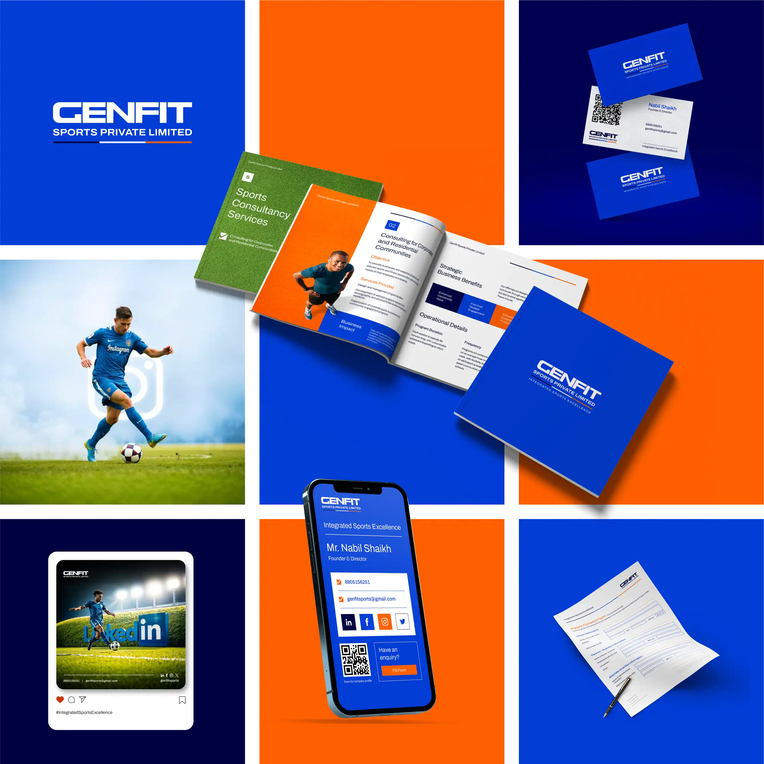
We began by reimagining their identity with a minimal, modern wordmark—one that reflected both structure and flexibility. The logo was intentionally clean, professional, and free of any overused sports iconography. This allowed Genfit to present itself as a serious, expert-led company rather than just another energetic sports brand. From this foundation, we developed a comprehensive brand system: a sharp color palette that balanced discipline with energy, a clear typographic hierarchy, and layout structures that allowed for easy replication across formats. Beyond the identity system, we worked on operational and communication design—creating proposals, company profiles, progress reports, consent forms, and other day-to-day documents. Every asset was thoughtfully designed to reflect Genfit’s philosophy of structured sports delivery. The result was not just a new look, but a set of tools that enabled the team to present themselves consistently, confidently, and professionally across every touchpoint.
300
x
Increase in Engagement
500
%
Faster Page Load Times
400
%
Growth in Conversion
Visual Style Guide Creation
aao ensure long-term consistency and ease of replication, we developed a comprehensive visual style guide that served as a blueprint for all future brand communications. The guide included a refined wordmark usage system, clear rules for logo placement, and scalable design principles that could adapt across formats.
#FF5F00
#000242
#F7F7F7
#99CC66
#8CA6DB
#013DD6
Typography
Archivo
Heading Font
Aa Bb Cc Dd Ee Ff Gg Hh Ii Jj Kk Ll Mm Nn Oo Pp Qq Rr Ss Tt Uu Vv Ww Xx Yy Zz
0123456789!@#$%^&*()_+
Sparklabs transformed our digital presence with their innovative strategies and expert team. Our engagement and sales have skyrocketed. We couldn't be happier with the results. Highly recommend their services!